征集码头论坛_LOGO_广告语_名字_征文_歌曲_包装_景观_文创征集网
标题: 揭晓 | 2017台湾国际平面设计奖(台湾国际识别设计奖—D类—活动识别 )获奖作品 [打印本页]
作者: 码头发布 时间: 2017-11-28 09:19
标题: 揭晓 | 2017台湾国际平面设计奖(台湾国际识别设计奖—D类—活动识别 )获奖作品
活動識別:各種商業性活動等標誌及系列應用作品。(D類)
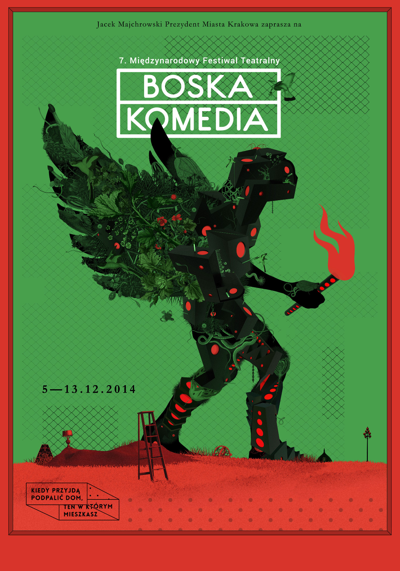
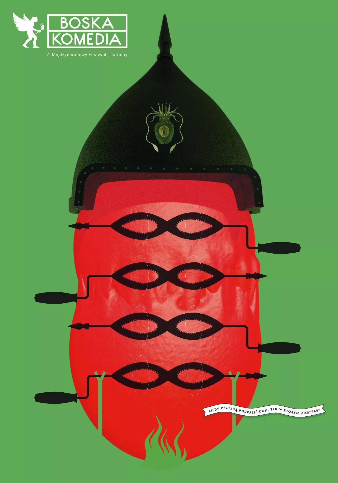
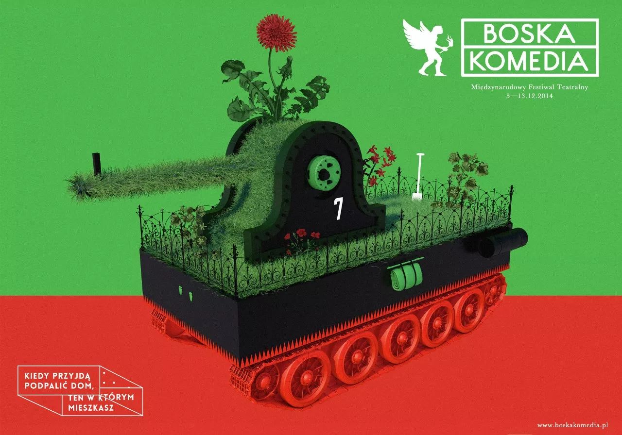
Divine Comedy (Boska Komedia) International Theatre Festival
Poster for 7th DIVINE COMEDY (BOSKA KOMEDIA) International Theatre Festival in Krakow, Poland (5—13 December 2014).This is the biggest theatre festival in PolandNine festival days as the nine Dantesque circles of the great feast of theatre — a competition of performances, a showcase and a revierw of worls premieres and debuts all in one.The slogan of 7th edition: "When they come to burn your home down, the one that you live in..."http://www.boskakomedia.pl
by 波蘭 Victor Soma
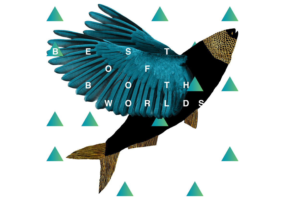
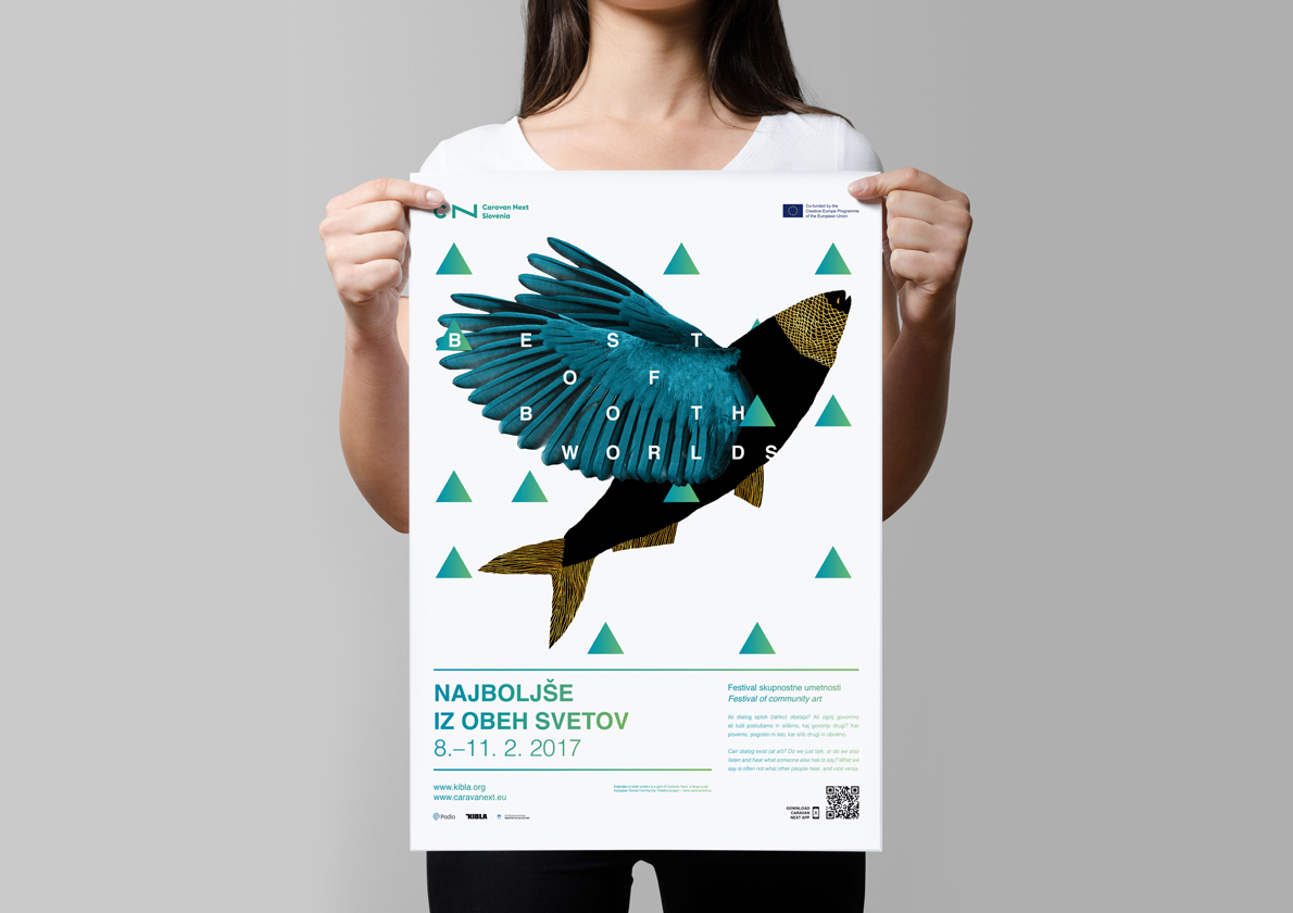
Best of both worlds
Event illustration for the Caravan Next Slovenia festival. The brief for the identity was duality and building bridges between the two. Monologue-Dialogue. Amateur-Professional. Local-Migrant. Written-Spoken. I have solved this by a visual pun of a fish with wings and coming up with the slogan Best of both worlds representing how two different notions benefit from each other when combined.
by 英國 Miha Kosmac
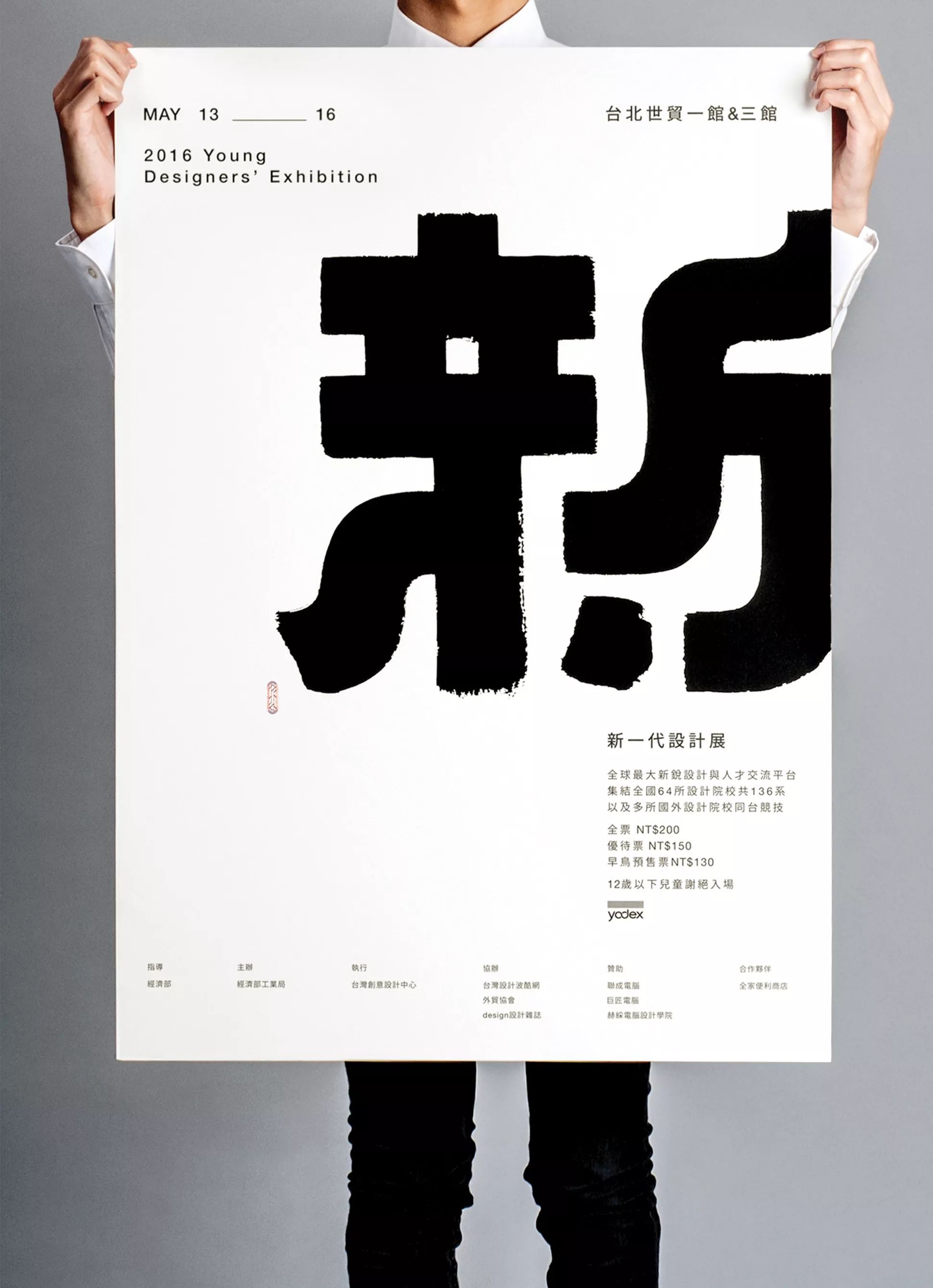
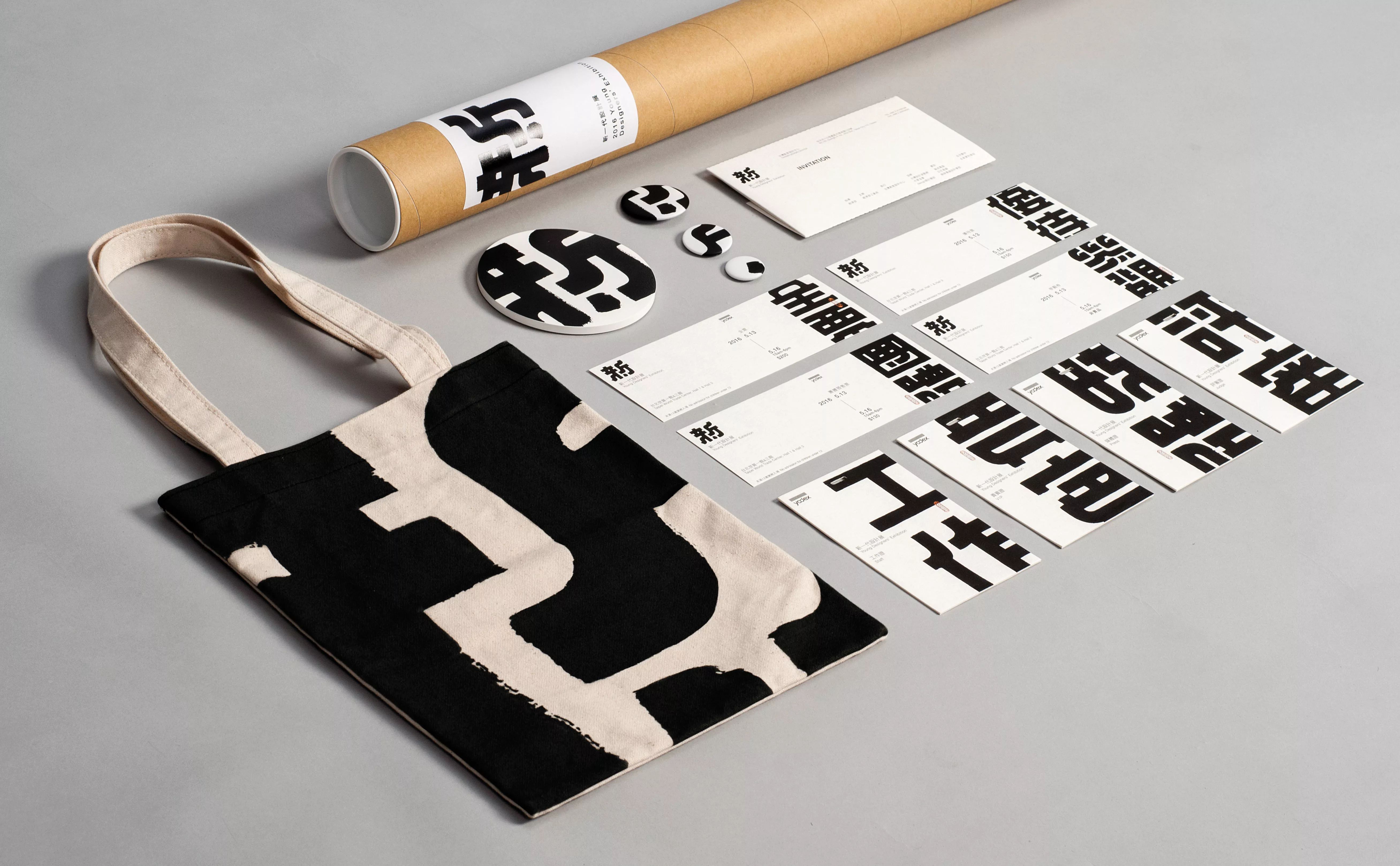
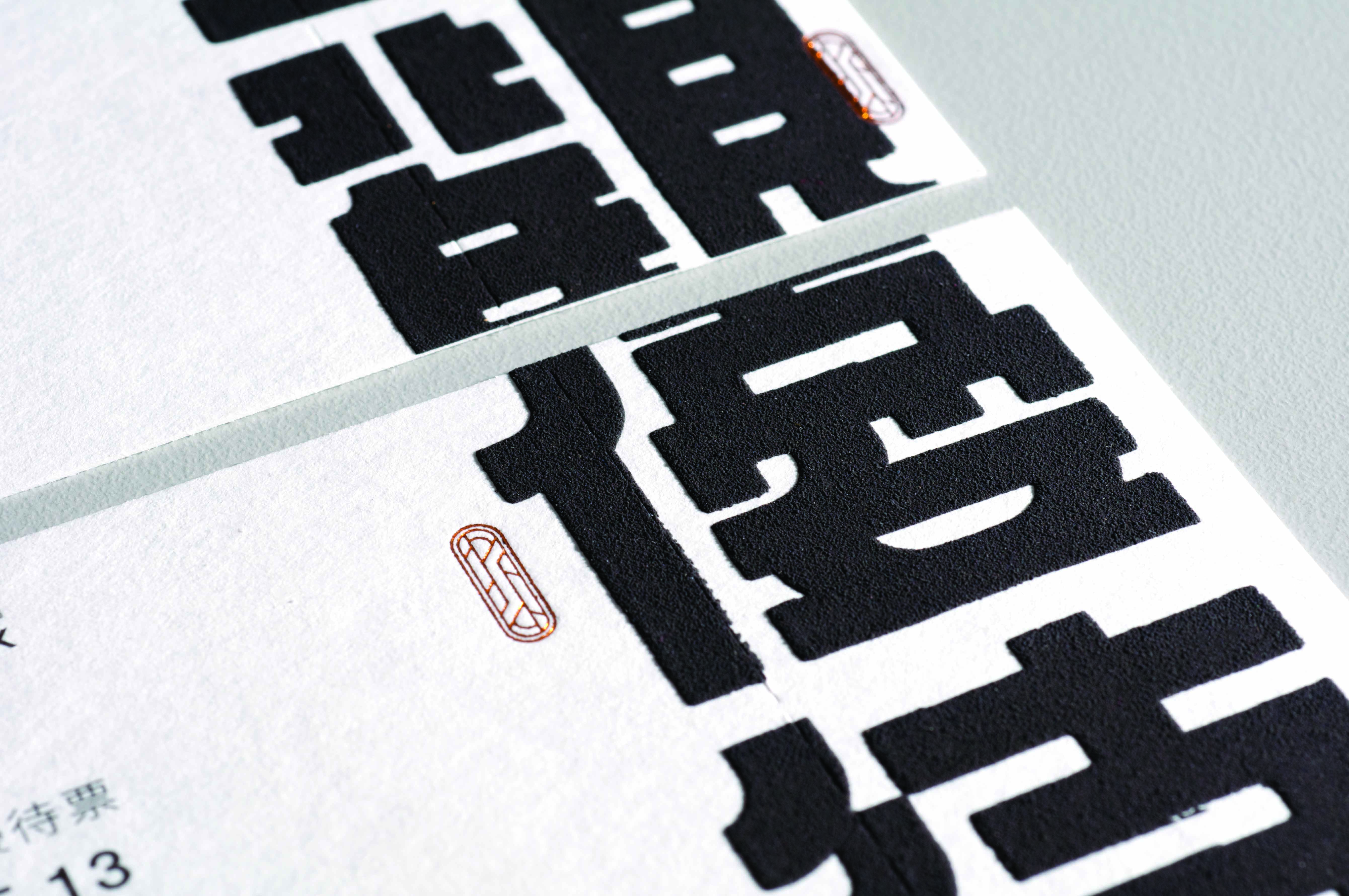
XIN
On the border of generation between the new and the old, clashes often arise between value and ideas thanks to ever-changing technology and rapid dissemination of information. We learn to think independently, refuse to blindly set foot on well-paved way and take up challenges with positive attitudes, especially when it comes to uncertainty. In spite of adversity, we are still able to turn it around and take it as the drive to move forward.
by 台灣 簡鈺書
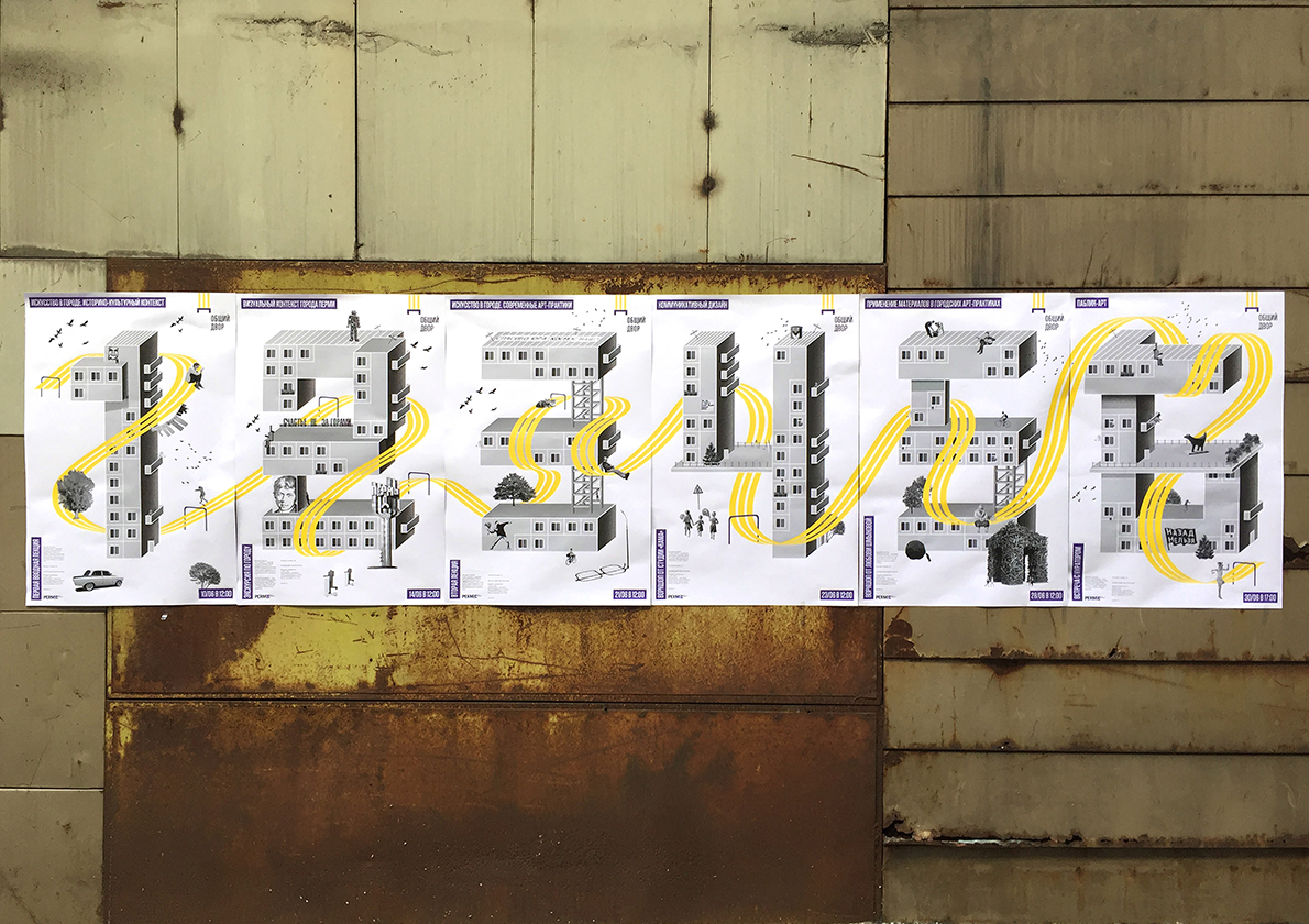
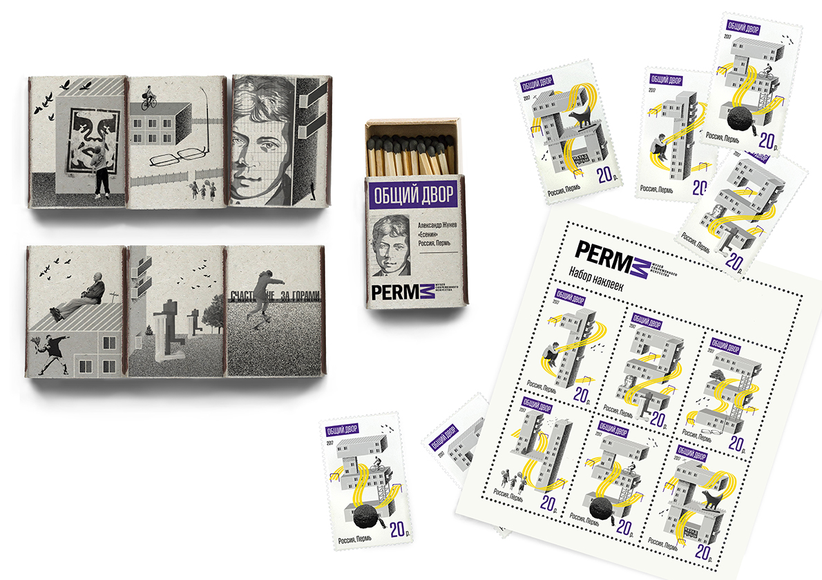
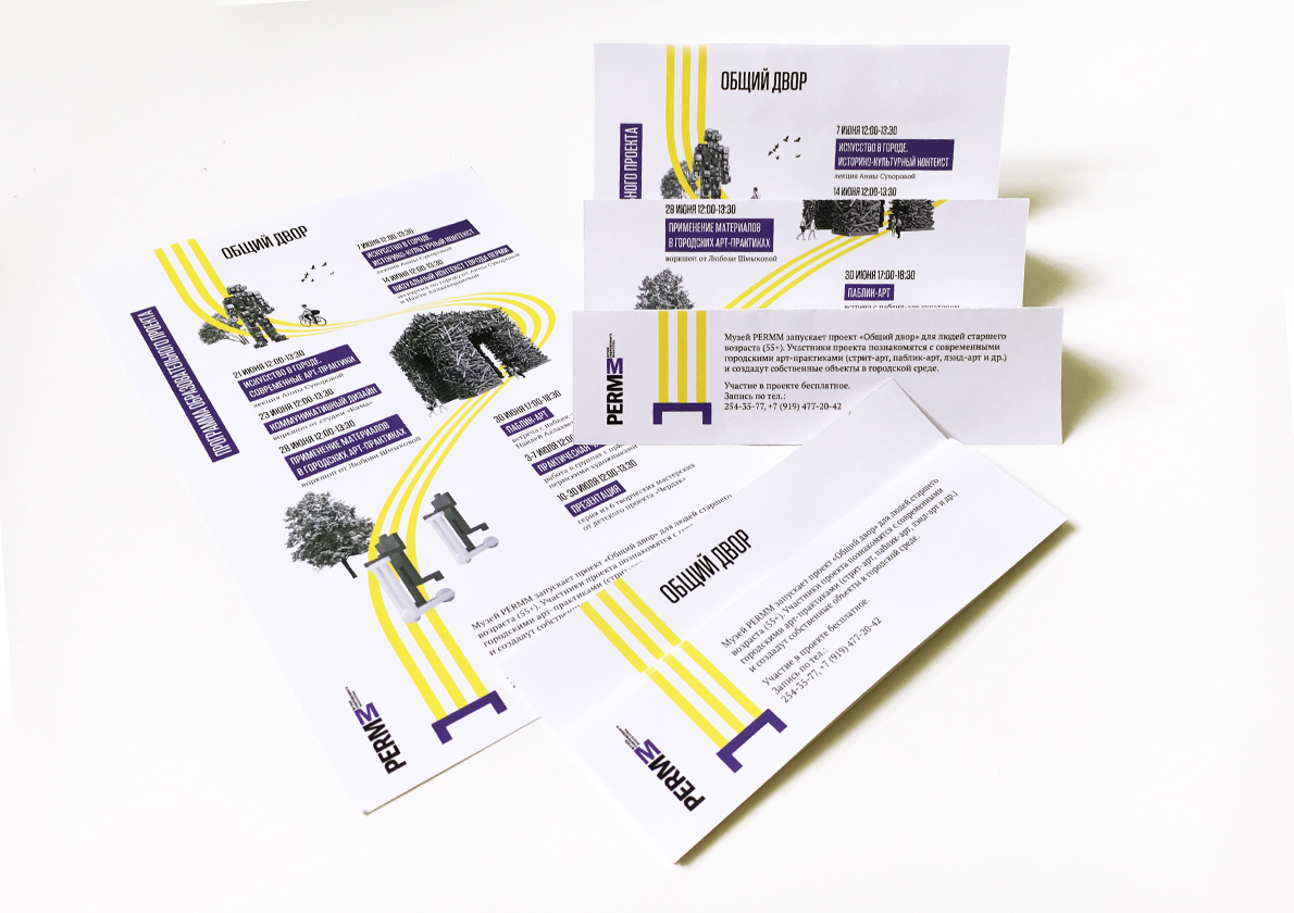
Сommon yard (Obshchiy dvor)
"Obshchiy dvor" ("Сommon yard") is an educational project of the PERMM museum that aims to introduce the actual land-art practices to the elder people. During the project, participants will be listening to the lectures, taking part in master classes and creating their own land-art objects for several Perm yards. To create an identity for this event we used three elements:-Structure of "Khrushchev houses" as a constructor for numbers and large elements in a poster (vector illustration), each poster shows the number of meeting-Bench, as the main symbol of the Russian court. It joins all the elements, deformed and stretched as necessary.-B/W photographs, corresponding to the topic of the lecture.Identity includes logo, posters, flyer, souvenirs (matchboxes, stamps)
by 俄國 Aleksandra Kazakovskaia
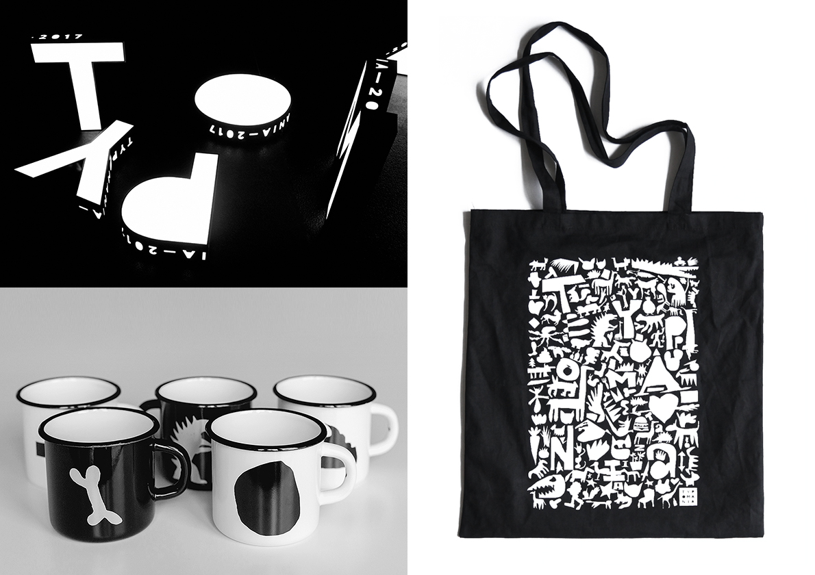
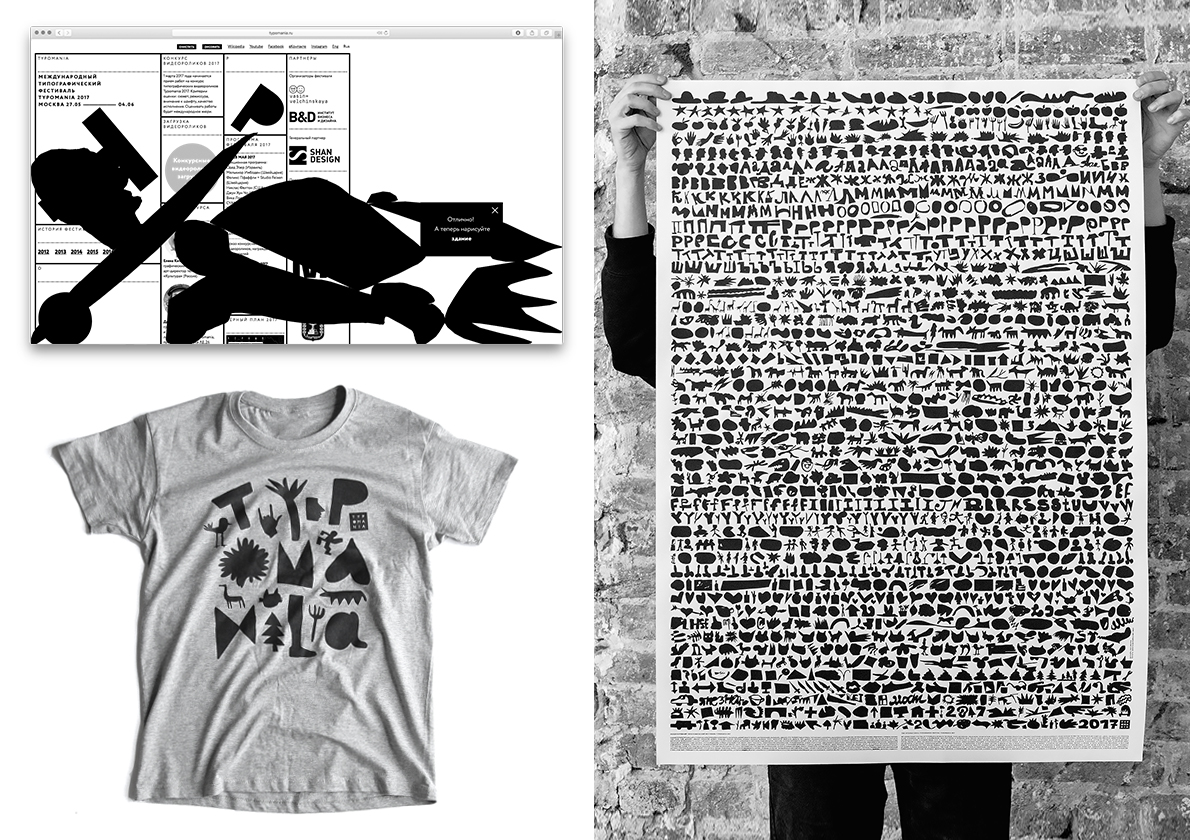
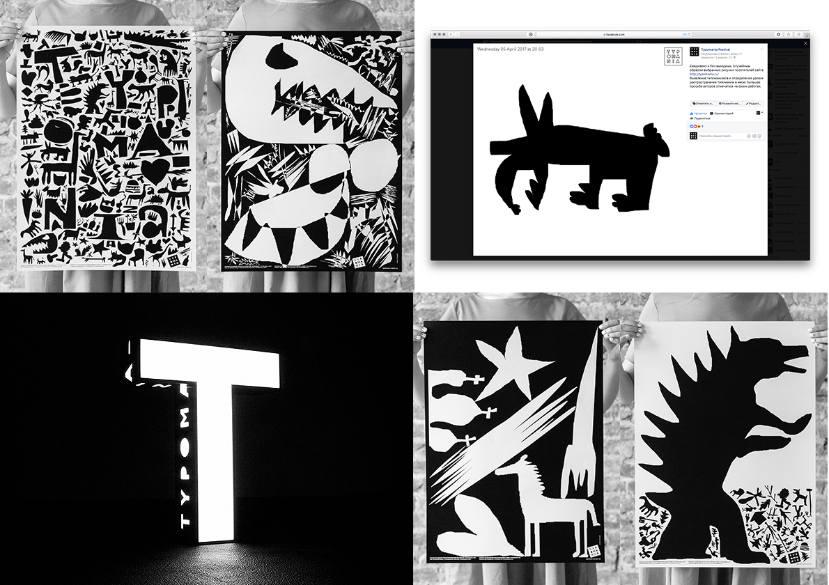
Typomania Festival 2017 identity
The International Typographic Festival Typomania is an annual type, typography, calligraphy and video event. The aim of the festival is to collect and connect as many type fans as possible and turn them in to a professional community.The main goal of 2017 Typomania identity was to involve public in the process of creating it, and by that creating a buzz around the event.On the Typomania website we switched the cursor with a pencil and let every visitor draw anything they want there. In the end we have got around seven thousand drawing to use in different promotional materials like posters, brochures, flyers, animated videos, and a lot of festival merchandise.As a result of this promo people have sent twice as many videos for the typographic video competition as in last year.
by 俄國 Phillip Tretyakov
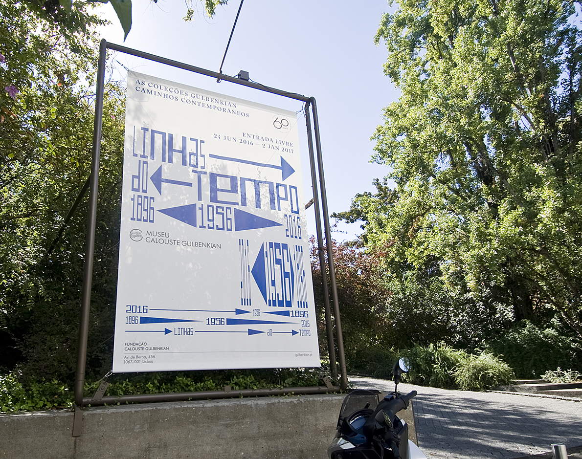
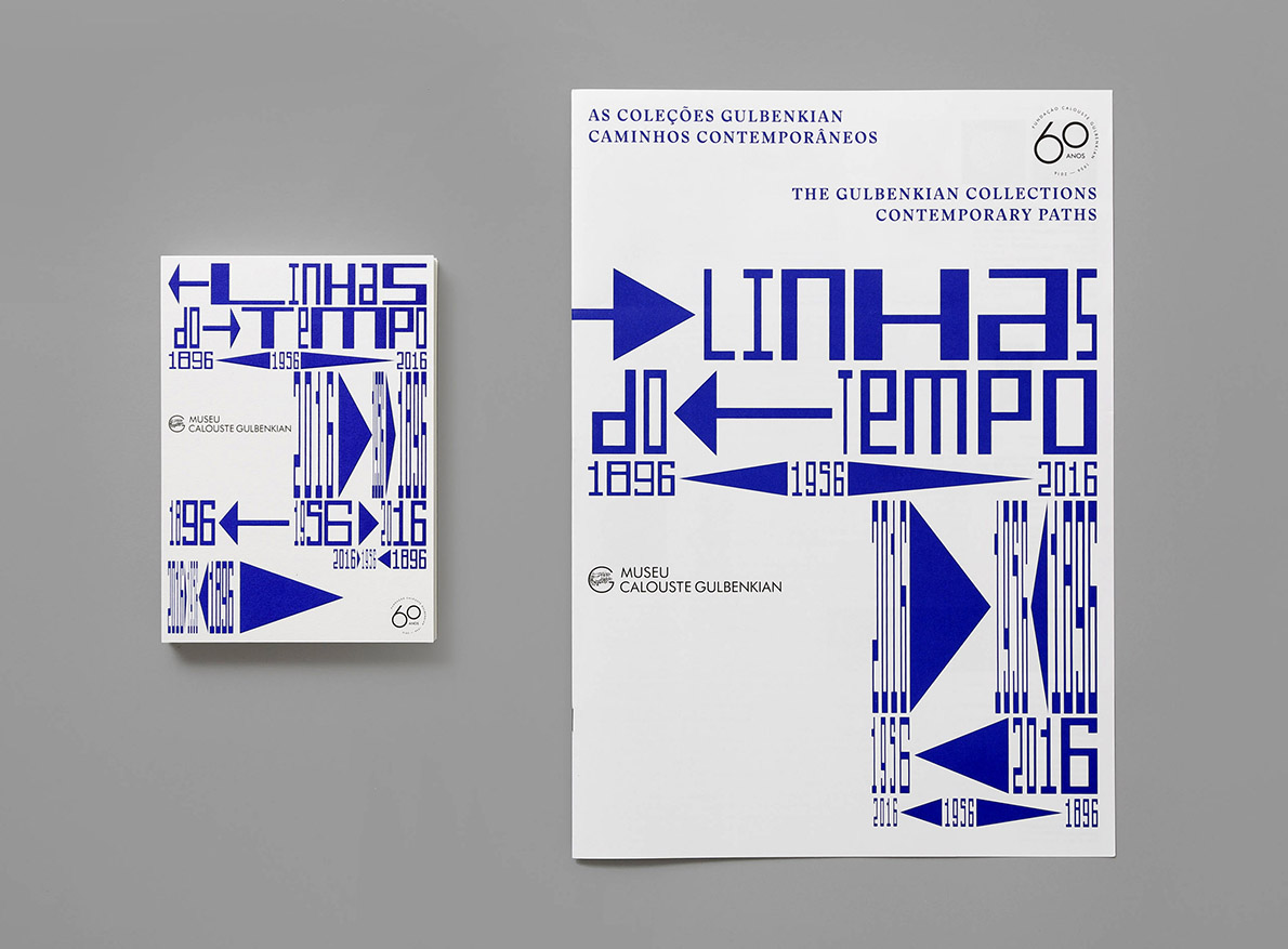
Lignes of Time
Retrospective art exhibition that merges the two collections — modern and classic — of the Calouste Gulbenkian Foundation (Lisbon, Portugal), since its foundation in 1956. Because it is a concept anchored in the notion of timeline, we used arrows and highlighted dates. The game between the arrows and the contents is responsive, adjustable to the different supports (posters, outdoors, invitations, …). We used two fonts — one with serif to evoke the classic collection, and one without serif to reinforce the contemporaneity of the modern collection, inspired by the the words of the curator, Penelope Curtis: "Gulbenkian could be as modern as the modern collection; the modern collection as historic as the founder. More or less modern, more or less in time, more or less in tune. More or Less.".
by 葡萄牙 Artur Rebelo
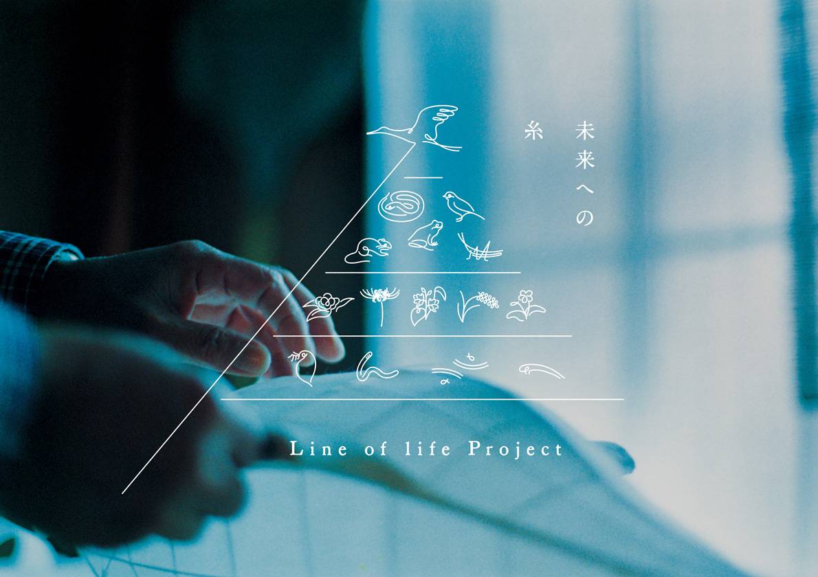
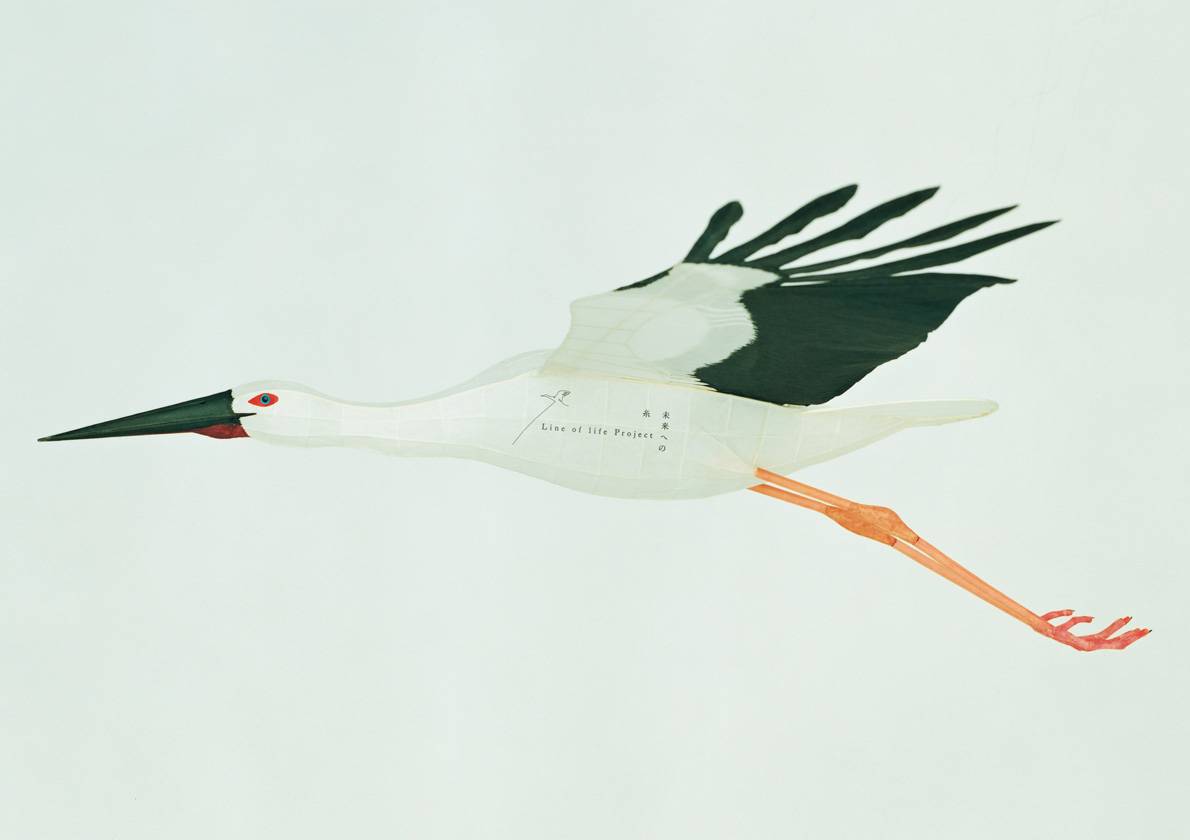
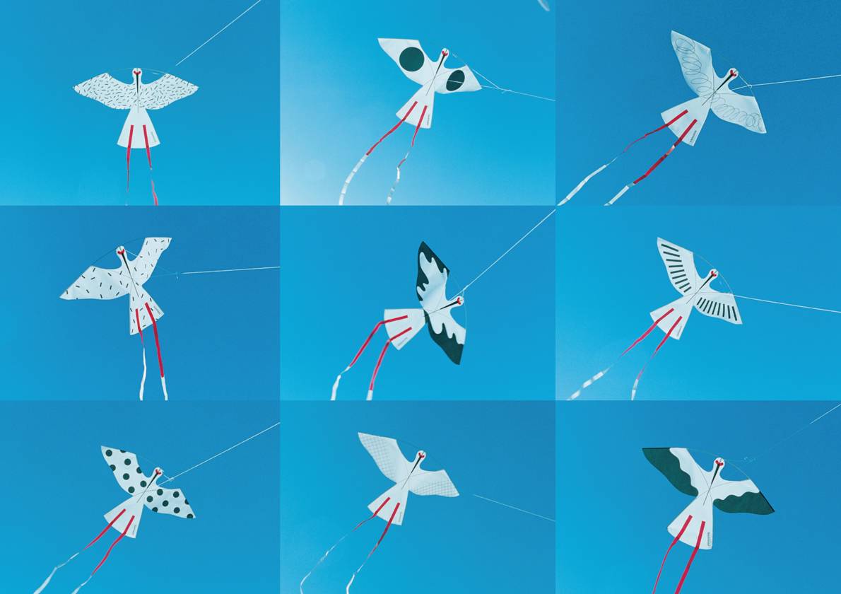
Line of life Project
by 日本 Shogo Kishino
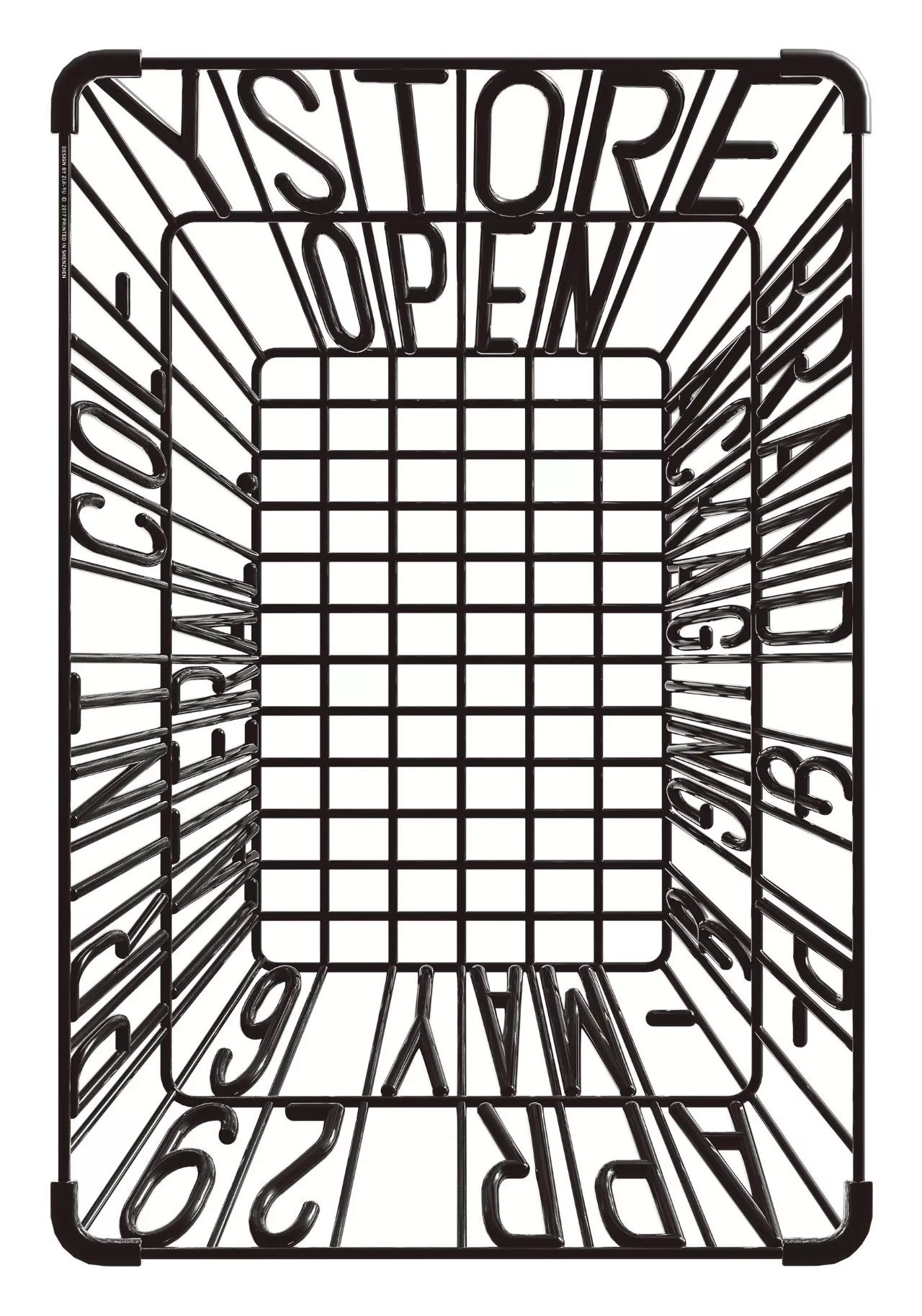
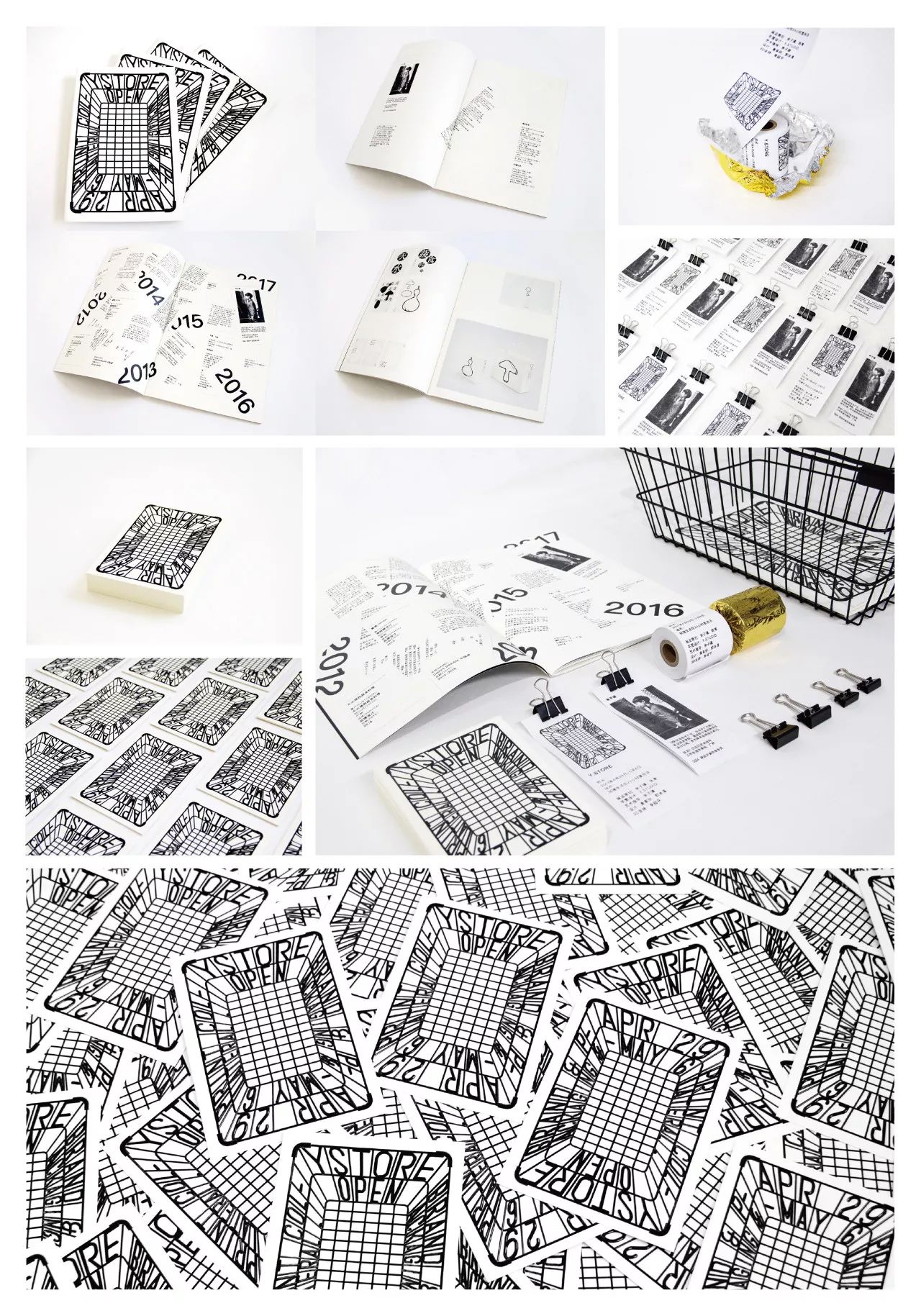
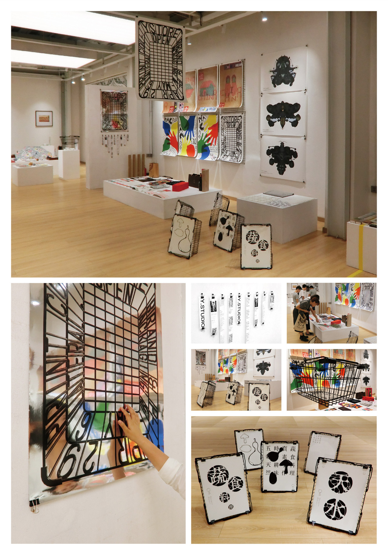
Y.STORE OPEN-展览形象
Y',源自我(Y'Studio)自己名字,更多的是与我的工作方式“WHY”相关,工作中跟自己及同伴对话最多的问题是为什么要这样做,设计于我自身而言是自我斗争中非零的博弈,以不同的角色参与在发现问题及解决问题中反复推敲及证实,直至“WHY”得以解决。Store是集品牌形象、体验、互动及售卖的场所,Y'Store是旨在呈现“Y“的多样性、适应性和创新性,是Y'Studio对外的形象及沟通的一次玩味诠释。
by 中國大陸 余子骥
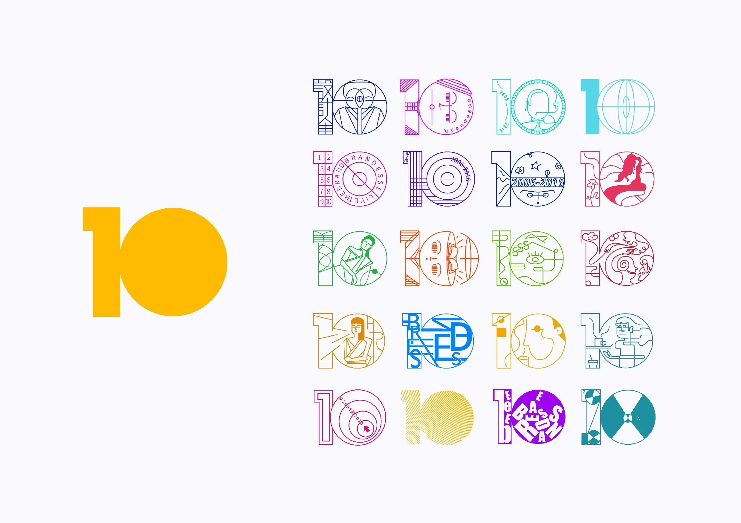
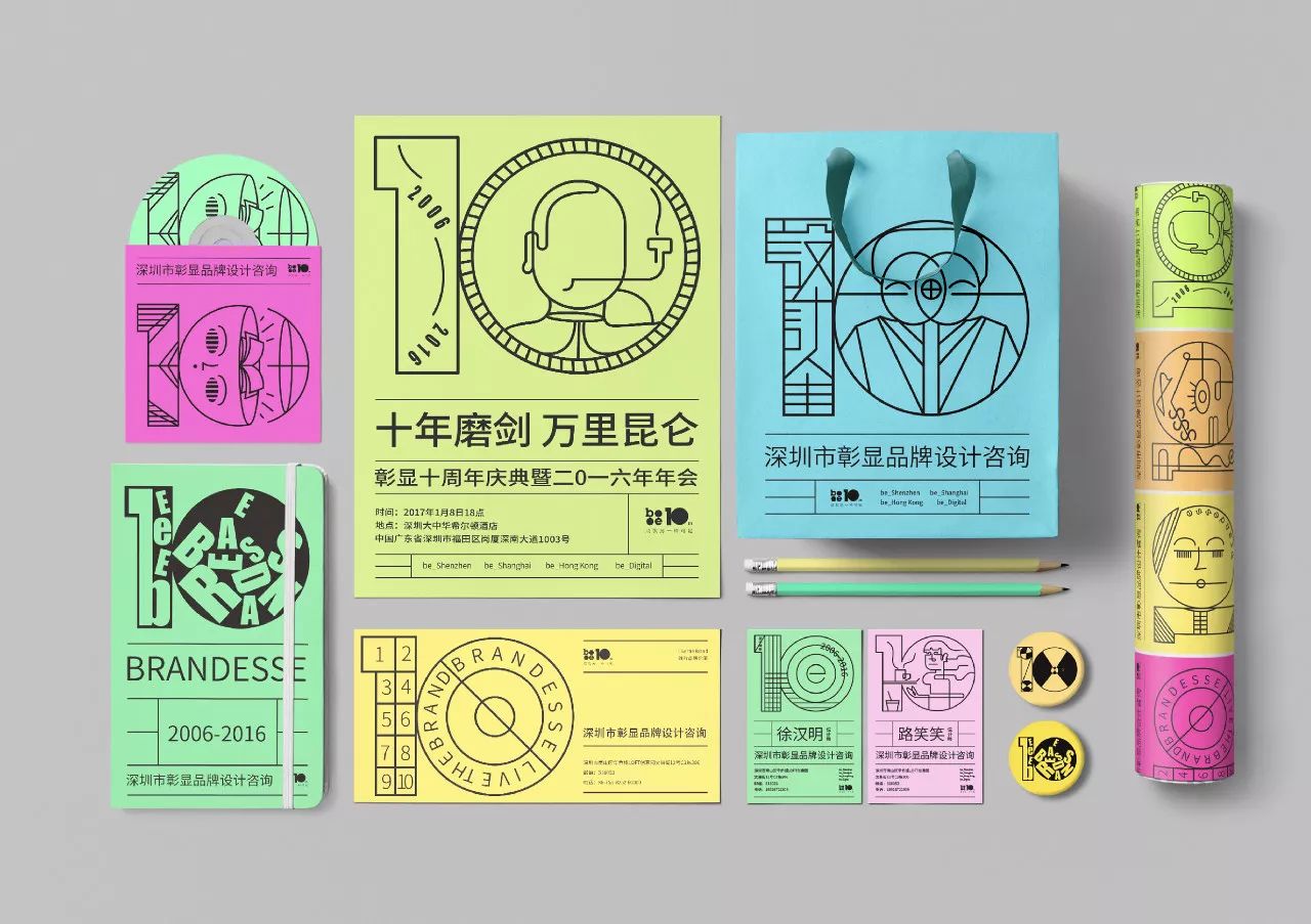
彰显十年
十年是怎样的十年?(是公司出品越来越高/福利越来越好/客户信任度越来越高)是这样的吗?答案(只有一起经历和见证过经过路过的人才能知道)由此我找了对彰显十年最有话语权的几种人,(服务的客户 业内人 员工 非业内也非客户)给了他们一张10字的纸,让他们画出或者写出对彰显最真实的印象和想说的话。我从他们里面挑选十多张进行了设计。十的logo就很直白的从公司logo中提取设计
by 中國大陸 徐汉民
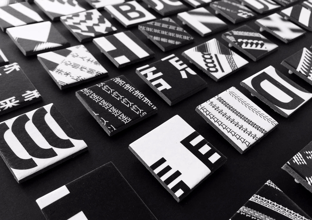
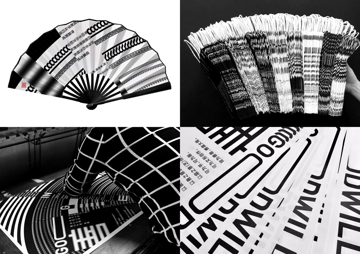
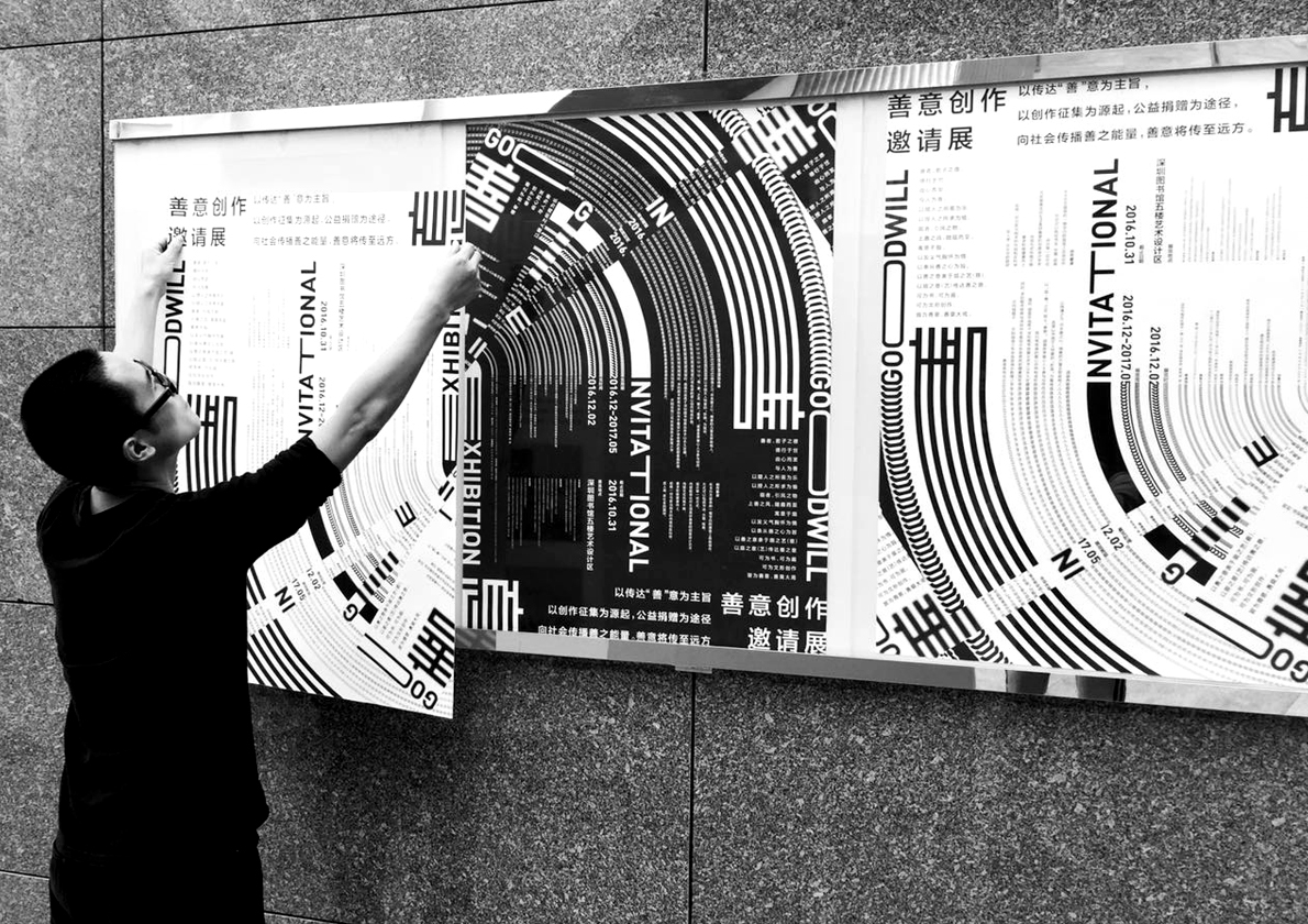
GOODWILL - Fan Creation Invitation Exhibition
善意-扇面创作邀请展活动形象设计
by 中國大陸 廖波峰
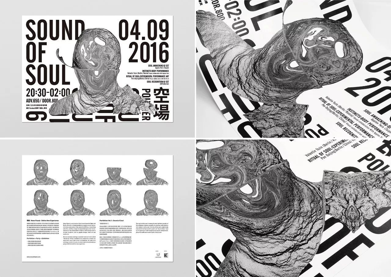
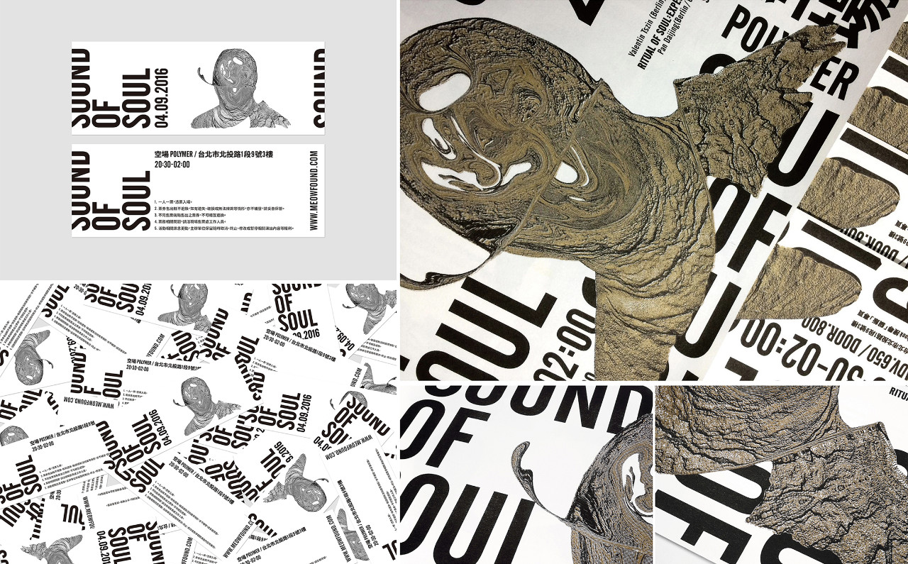
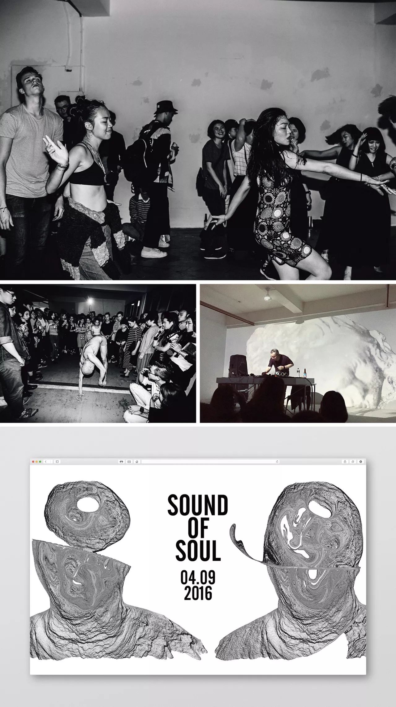
Sound of Soul
為策展團隊貓飯2016年於空場舉辦之活動「Sound of Soul」所規劃之視覺。
by 台灣 彭冠傑 Jay Guan-Jie Peng
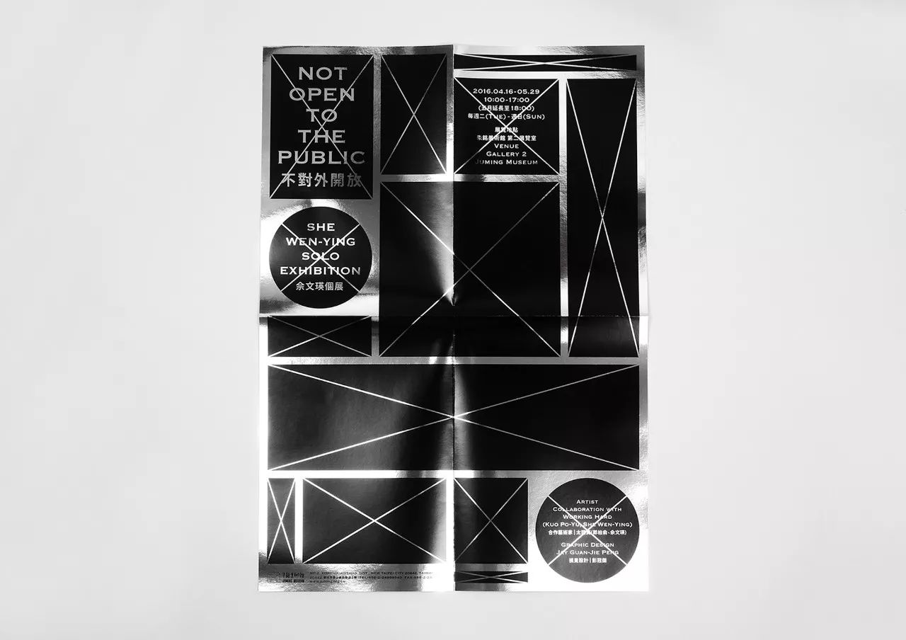
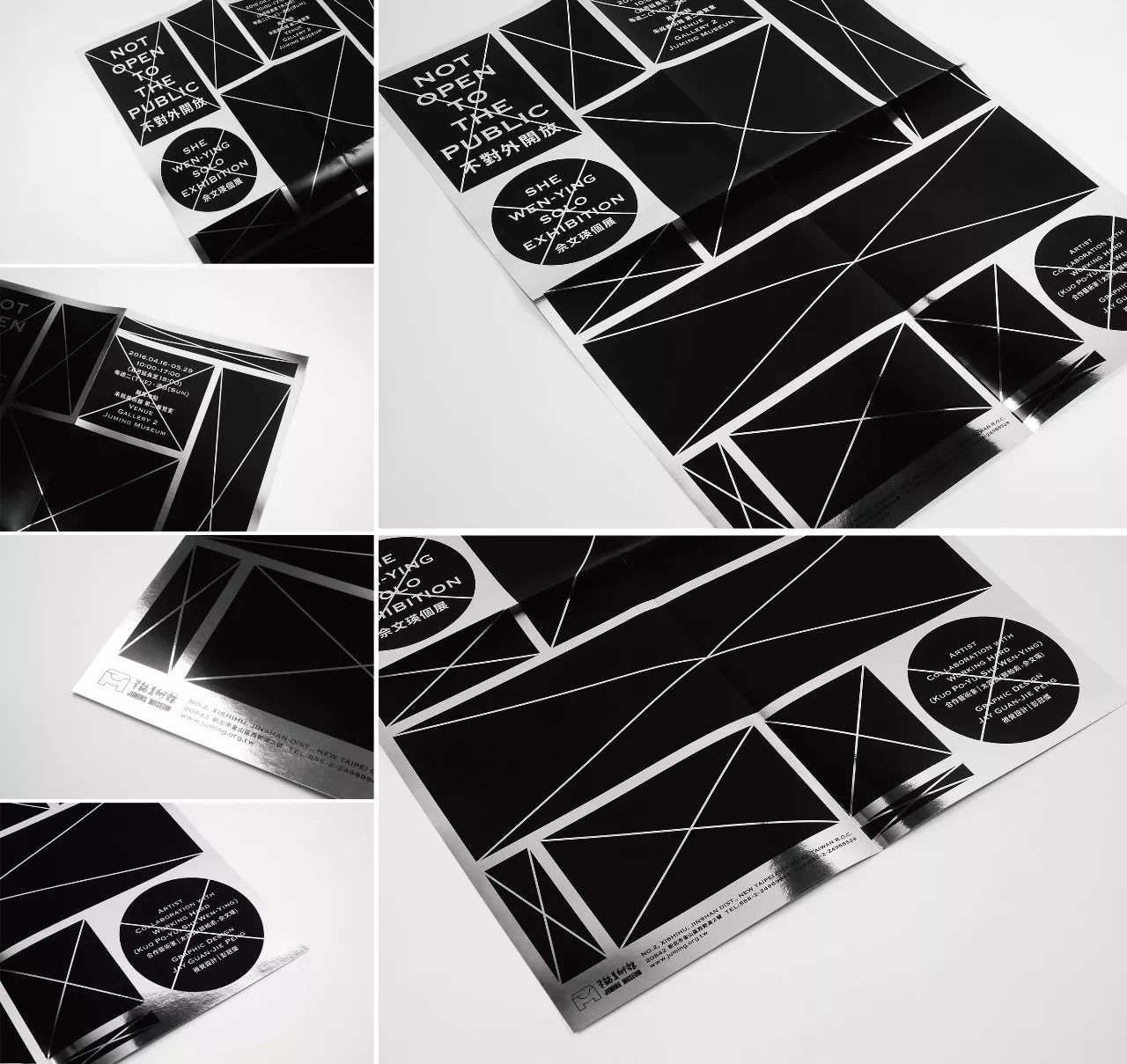
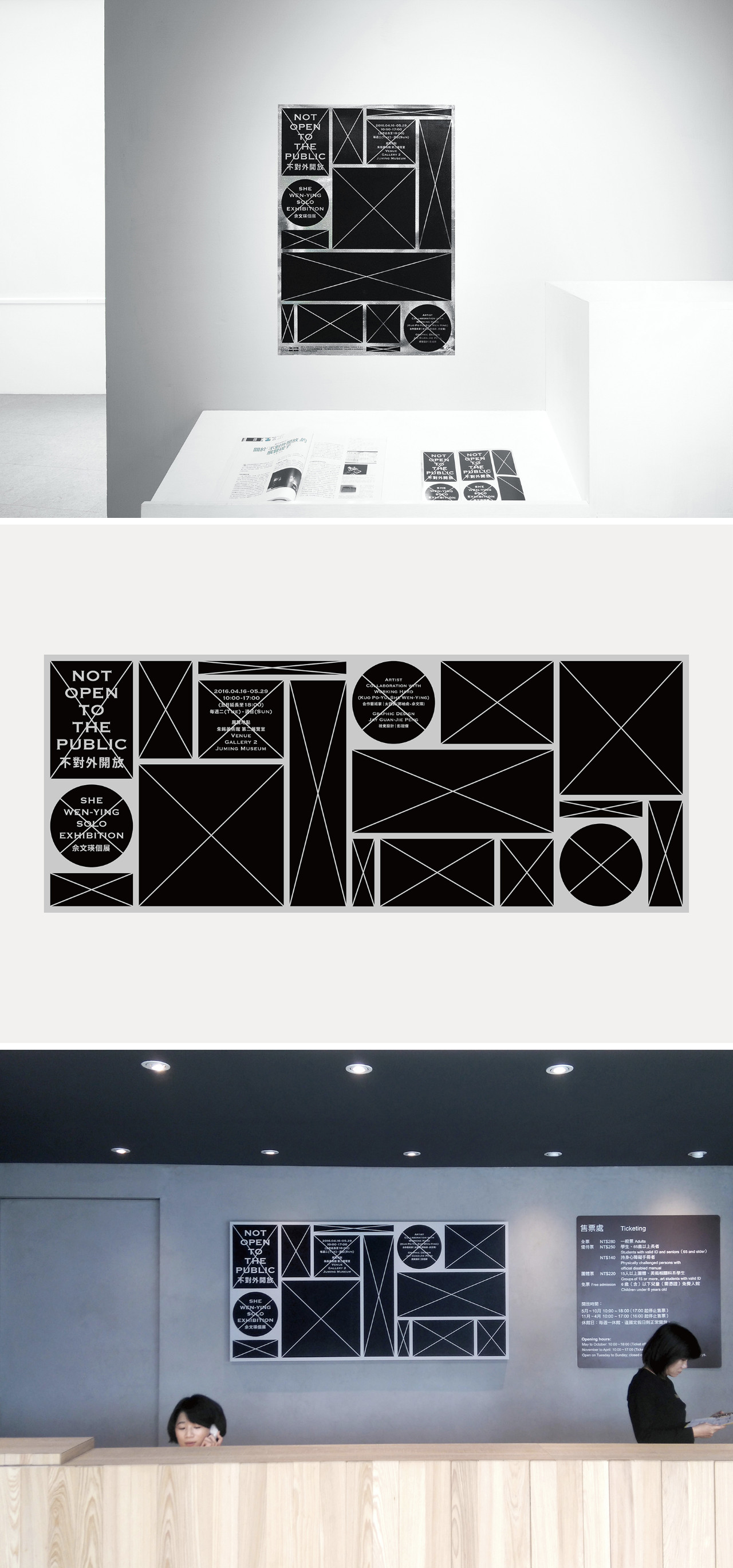
Not Open to The Public 不對外開放
為藝術家佘文瑛2016年於朱銘美術館舉辦之個展所規劃之視覺。
| 欢迎光临 征集码头论坛_LOGO_广告语_名字_征文_歌曲_包装_景观_文创征集网 (http://zhengjimtcn.com/) |
Powered by Discuz! X3.2 |
